Case study
Osobista emerytura
Digital design, Development
Task
Design and implement a platform allowing users to create a personalised retirement plan
Challenge
The goal was to create a website to raise awareness of the importance of managing your personal finances with a long-term perspective in the future. It should encourage users to save for their retirement, giving them a customisable plan they can execute on.
Outcome
The goal was to create a website to raise awareness of the importance of managing your personal finances with a long-term perspective in the future. It should encourage users to save for their retirement, giving them a customisable plan they can execute on.
User experience
Asking the minimum number of questions
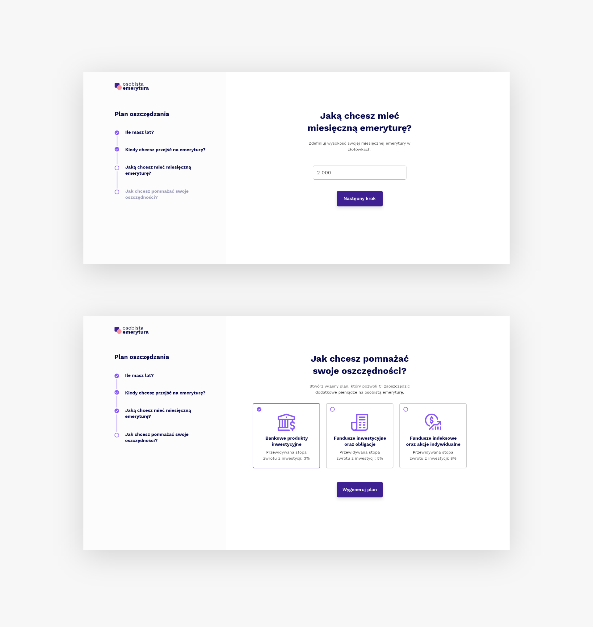
When thinking about the process that the user goes through when creating a retirement plan I focused on making it as short as possible. For this very purpose I created a four step form based on which the plan is generated. Each step is an individual screen, so that the user can focus on one thing at a time.

Functionality
Full flexibility
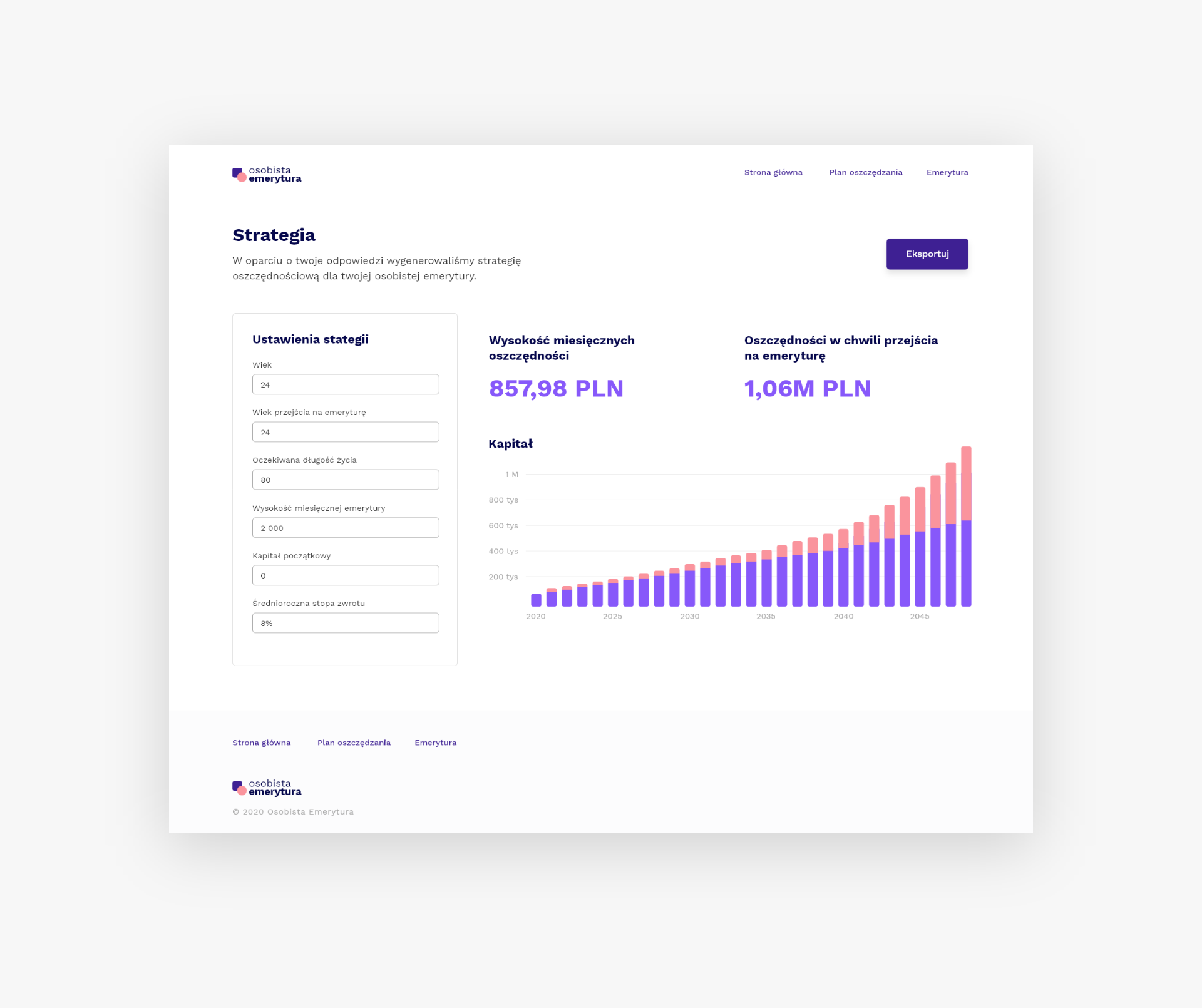
Once the plan is generated it's important to give a user a possibility to easily change and experiment with different settings. To ensure this, next to the plan preview there is a settings panel. It contains the same inputs as the initial form and additional ones, giving the user more power over the generated plan. Each input change automatically triggers a plan update.

Development
Iterating quickly and with confidence
The application was created with TypeScript using React stack. In order to iterate quickly and focus on the user experience rather than just the design, I used ChakraUI component library. It helped creating a very consistent and fully customisable interface. The website is hosted and deployed automatically using Netlify (with a pipeline including Eslint and tests using Jest as well as React Testing Library).